top of page


KAI
ECO-FRIENDLY LIFESTYLE APP

User Research and Data Analytics

Content Writing and Strategy

User Interface Design and Branding

Interaction Design
OVERVIEW
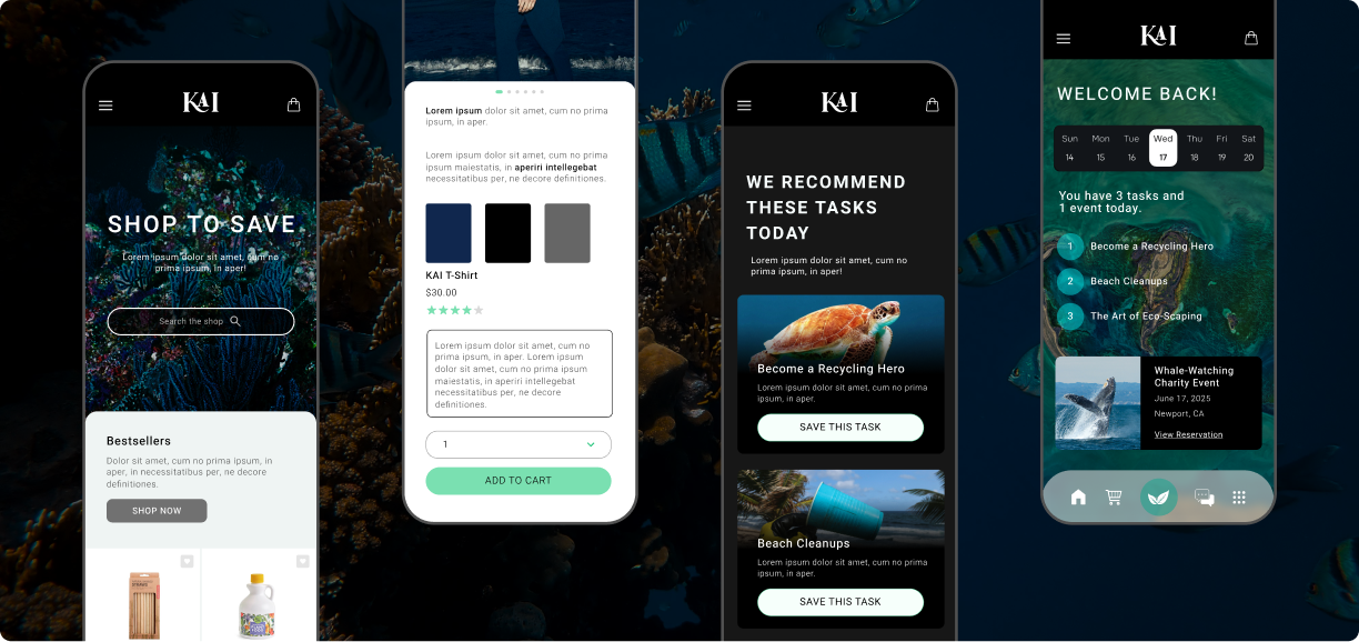
KAI is an eco-friendly lifestyle brand that illustrates the importance of continual research and iteration, while demonstrating energy-efficient design choices. In an era of information overload and emotional overwhelm, KAI aims to provide its users with trustworthy resources that are integral in the creation of a more sustainable lifestyle. Founded in a deep understanding of its target audience's psyche, KAI is designed to give users peace of mind and confidence in their actions.
GOALS
-
Create a product that helps users commit to a more eco-friendly and sustainable lifestyle.
-
Ensure that the product speaks directly to user needs, fears, and motivations.
-
Address societal needs and stay ahead of industry trends by finding ways to boost offline community, while providing invaluable online tools and resources that keep engagement levels high.
RESEARCH
-
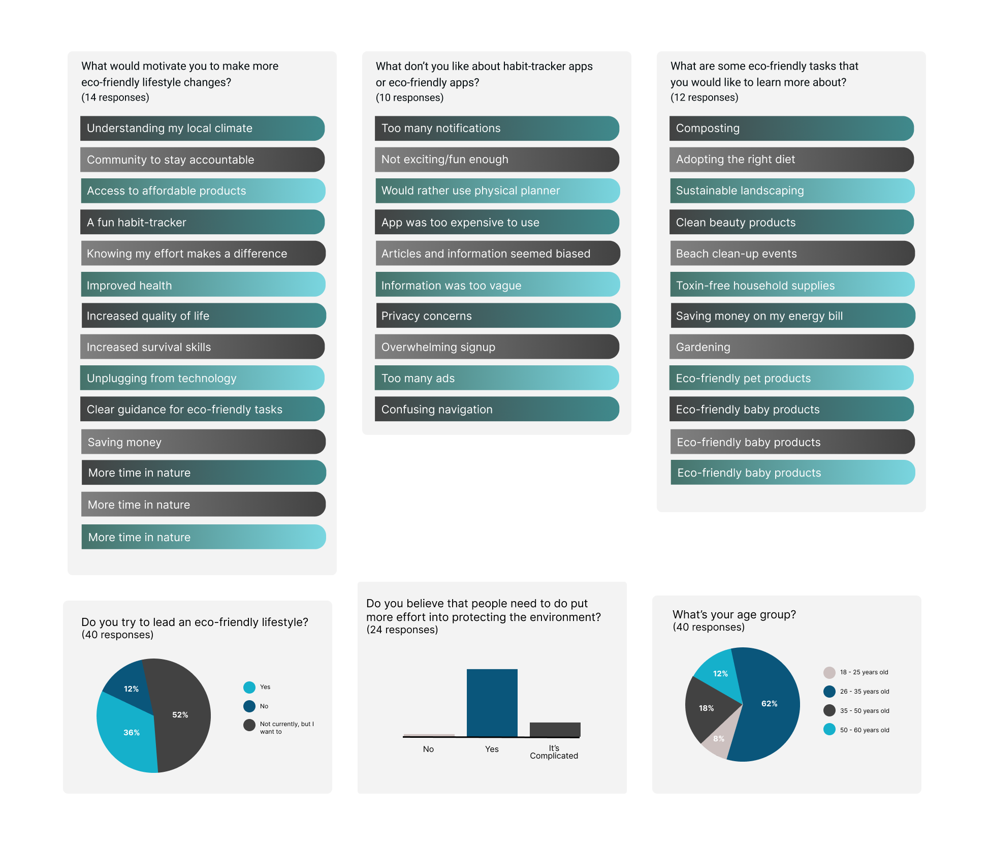
I conducted extensive research to better understand my target audience’s motivations, frustrations, and desires.
-
I found that offline community involvement (especially time in nature), access to affordable, eco-friendly products, and a better understanding of one’s local climate were top motivators in adopting a more eco-friendly lifestyle.
-
I also discovered that the majority of people surveyed felt that they should be doing more in order to protect the environment.
-
Competitor brands and industry trends were consistently analysed as my flows and frames began to take shape in Figma.
DATA-DRIVEN DECISIONS
-
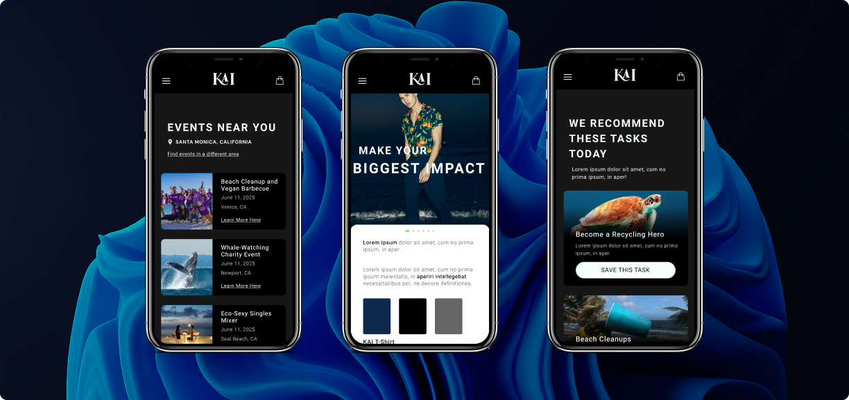
The name KAI was inspired by the Japanese term "kaizen," which is a concept defined by small, ongoing, positive changes that lead to continual evolution. In other languages, it means "keeper of the keys" and "keeper of the earth." An earthy, modern color palette, universally recognized icons, and clean typefaces were carefully selected and adjusted until they paired perfectly with KAI's eco-conscious and forward-facing message. In addition to representing the Earth, green pixels use 25% less energy than blue pixels. (By the way, dark-mode options, which a study at Purdue found to use 39-47% less energy than light-mode, are included in all Pixel Pixie Co. designs.)
-
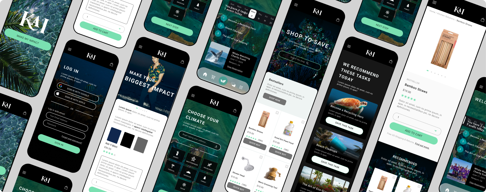
The Climate Guide: My research revealed that users want to experience greater amounts of clarity and confidence online. In metropolitan areas like Los Angeles and London, I found that many people don’t know how to identify their local climate or determine the ways that they can make their greatest impact on the environment. I incorporated a climate guide into KAI's signup process to help give users confidence in their journey.
-
Gentle Guidance: A desire for gentle and simplified guidance was a reoccurring theme for surveyed users. Personalized resources, including blogs and recommended tasks, which can be saved and incorporated into the user’s calendar, are key for KAI.
-
Community Connections: Many people is today’s society long for ways to connect with others while maintaining their busy and multi-faceted lives. Connecting users with offline communities, like hiking and beach clean-up groups, is a paradoxically powerful strategy for making KAI an invaluable asset. I added a community forum for users that are unable to attend in-person events.
ARCHITECTURE

OUTCOME & KEY TAKEAWAY
This glimpse into the development of KAI is a tiny percentage of the work that was done. Continued conversations with users and industry leaders have convinced me that creating products like KAI is how designers can make their biggest impact in the world. I learned that, in order to conjure truly delightful experiences, I need to go beyond basic user needs to uncover the deeper desires of a user’s psyche and society’s collective consciousness.
KAI was one of my first projects as a product designer, but it remains the foundation of Pixie Pixel Company’s approach to thorough research and the pursuit of user connection.
bottom of page
